Picking an icon library usually stops at the licence. Check that it is free, check whether attribution is required, download, move on. The trouble starts later, when icons from three different sources end up on one screen and something looks off without anyone being able to say what.
I went looking at Phosphor and decided to test that. One heart icon from five libraries, rendered at the same size, counted pixel by pixel. The short version: libraries with identical specs did not come out looking the same.
Same 96px box, different actual size
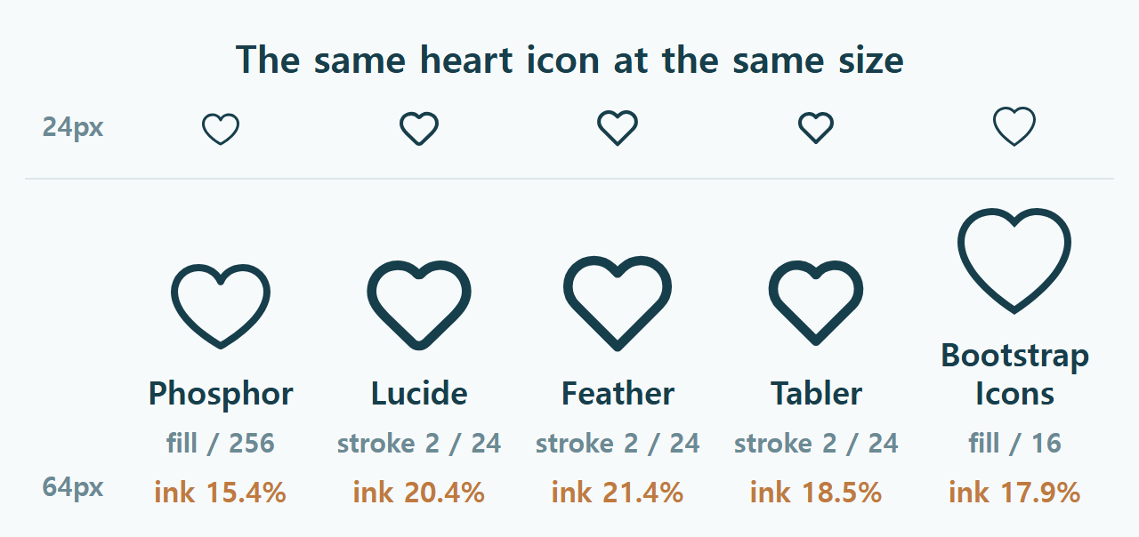
Each icon went into a 96px box on its own, and I measured how much of that box the drawing actually occupied plus the share of dark pixels. Files pulled from each repository on 3 August 2026.
| Library | Drawn width | Of the 96px box | Ink coverage |
|---|---|---|---|
| Phosphor | 84px | 88% | 15.4% |
| Lucide | 88px | 92% | 20.4% |
| Feather | 92px | 96% | 21.4% |
| Tabler | 80px | 83% | 18.5% |
| Bootstrap Icons | 96px | 100% | 17.9% |
Same box, and the drawing came out anywhere from 80px to 96px wide. Tabler to Bootstrap is a 17 percentage point gap. Put them in a row and one of them looks oversized, and that is a measured number rather than an opinion.
Ink coverage stands in for how heavy the line reads. The range runs 15.4% to 21.4%, so the lightest and the heaviest are about 1.4× apart. Mix those two and the mismatch is visible.
Why do identical specs produce different results?
Because the spec does not describe how much padding the drawing leaves inside its own grid. Open the files and Lucide, Feather and Tabler are all a 24 grid with stroke width 2. On paper they are the same icon system three times over.
The measurements say otherwise: ink coverage of 20.4%, 21.4% and 18.5%, widths of 92%, 96% and 83%. Same grid, same stroke, different amount of the grid actually used.
Which means a comparison table cannot settle this for you. Once the shortlist is down to two or three, put them at the same size and look. It takes about a minute.
Stroke or fill, and why it matters
The practical divide is whether CSS can change the weight. Lucide, Feather and Tabler are stroked, so setting a stroke width works exactly as expected. Want them lighter, drop the number.
Phosphor and Bootstrap Icons are filled shapes. Setting a stroke width does nothing at all. No error, no warning, the declaration is simply ignored, which is a fine way to lose twenty minutes wondering why one icon refuses to match the others.
Neither approach wins. It is a trade. Stroked libraries hand you one drawing and let you set any weight. Filled libraries hand you several weights that somebody drew and corrected by hand, which is the only way to fix the spots where a mechanically thinned line starts looking wrong.
Phosphor ships weights as separate files
Six of them: Thin, Light, Regular, Bold, Fill and Duotone. Every icon exists once per weight as its own file, which is what a filled library has to do instead of exposing a stroke width.
The count comes out two ways. The official readme says 1,248 icons and counting. Counting the files in the repository today gives 1,512 per weight, so 9,072 files across the six. The “and counting” probably explains the gap. Both numbers are here because I am not in a position to declare either one wrong.
The useful part is that 9,072 is not nine thousand different icons. It is 1,512 icons drawn six times. That distinction is worth carrying to every icon site that advertises a headline number, because some of those numbers count variants and some count subjects.
The licence is MIT, so no attribution and commercial use is fine. There are separate distributions for React, Vue, Flutter and Figma, plus a webfont build.
Marketplaces are a different product
Sites like Flaticon or Iconfinder are not one set. They are collections of packs from many different illustrators, which is why a search almost always returns the exact subject you wanted. That strength is also the catch: pick three results and you have picked three different people’s drawing conventions, so the mismatch measured above happens inside a single site.
Attribution rules differ too, and I went through that in the piece on free image licences rather than repeat it here. The one-line version is that free tiers on the big marketplaces usually want a credit line and MIT-licensed sets do not.
So the choice splits by job. Need one specific illustration that no icon set includes, use a marketplace. Need twenty icons for one interface, take a set. That was roughly the conclusion when I looked at eight lesser-known resource sites as well.
What breaks at 16px?
The ratio of stroke width to grid size. I hit this making the favicon for this site: the book mark from the header, scaled down, turned to mush at 16px.
The original was drawn on a 34 grid with a stroke width of 1.5. Scaled to 16px that stroke lands at 0.7px, thinner than a physical pixel, so it renders as a grey smear. The redraw uses a 512 grid with a stroke width of 46, which works out to roughly 1.4px at 16px, and the book glyph itself grew from 40% to 60% of the width.
This is where the ink coverage column earns its keep. A library that measures light looks elegant at 48px and disappears first at 16px. If icons are going into a 16px or 20px slot anywhere, test at that size before deciding, not after.
The WordPress catch
Pasting SVG markup into a post often fails silently. WordPress strips SVG tags from content saved by any user without the unfiltered_html capability.
I checked it directly. A paragraph, an inline SVG, another paragraph, saved and read back: two paragraphs, no SVG, no error and no warning anywhere.
Contributor and Author roles run into this. The two ways round it are uploading the icon to the media library and inserting it as an image, or using a webfont build and calling icons by class name. Phosphor publishes a webfont, so that route is a stylesheet link and a class. The comparison figure in this post is a PNG for exactly this reason.
How to choose
Three checks. Is it stroked or filled, because that decides whether CSS can adjust the weight. Does it hold up at the smallest size you plan to use. And does the set actually contain every icon on your list, because the moment one is missing you go somewhere else for it, and that is where the mismatch starts.
Two things to be straight about. These numbers come from one heart icon, not an average across each library, so the ordering could shift on a different shape. And I have not shipped Phosphor in a real project. What I measured is the files and what a browser drew from them. The method transfers, though, so once you have a shortlist, render them at one size and look at the row.